Party City
Faster Shopping with Live Inventory

Summary
Mission
Party City is the largest retailer of party goods in the U.S., with 700+ stores across the U.S., Canada, and Mexico, and an online inventory of over 50,000 products. Their goal was to increase conversion by clearly displaying inventory data, preventing user errors, and removing checkout blockers caused by inventory issues.
My Contributions
As the principal UX Designer, I worked with the Engingeering and Store Operations team to create a global banner that used auto-geolocation to display a user's nearest pickup store, redesigned product pages to display live inventory data from that store, and created a go-forward path for out-of-stock items by allowing users to (1) change their pickup store to another nearby store or (2) switch from pickup to shipping.
Impact
After the redesign, cart abandonment decreased by 6%, while conversion increased by 1% during a 90-day monitoring period and 32% after the busy season. Customer satisfaction also increased by 10%.
Client
Party City | Pleasanton, CA
Services
User Interface Design
User Experience Design
User Experience Strategy
User Research
Persona Creation
Wireframing
Webflow Development
THE PROCESS - STEP 1
Discovery
Platform
Party City has a responsive website, with 74% of our users browsing our site through a mobile device and then completing their purchase on desktop. Therefore, while we have designed for both desktop and mobile, we approach designs from a mobile-first perspective.
Our Users
Our primary target audience consisted of mothers who wanted to create celebratory moments with their families. They prioritized speed, value, and finding specific products they knew their children would love, with 70% of users opting for in-store pickup. We designed our new experience with these users in mind.

User Persona
The Problem
“It said ‘In-Store Pickup,’ but I still can't get it?!”
“Why show me items that aren't available at my store?”
“Why isn't there an option to filter items based on store, like Target?”
After reading the lowest ratings from our customer feedback and reviewing shopping sessions through Auryc, our session replay software, it was clear that users were abandoning their shopping sessions due to pervasive inventory problems.
The main issues:
Users didn’t know which store they were shopping at when they landed on the site.
Our site didn’t have a way to filter out unavailable items on the PLP.
Many SKUs that displayed an “in-store pickup” label were actually unavailable since inventory data was buried under a link on each product (see 2nd and 3rd screen).
Customers who didn’t select their store using the Store Availability modal were defaulted to shipping, resulting in confusion at checkout.
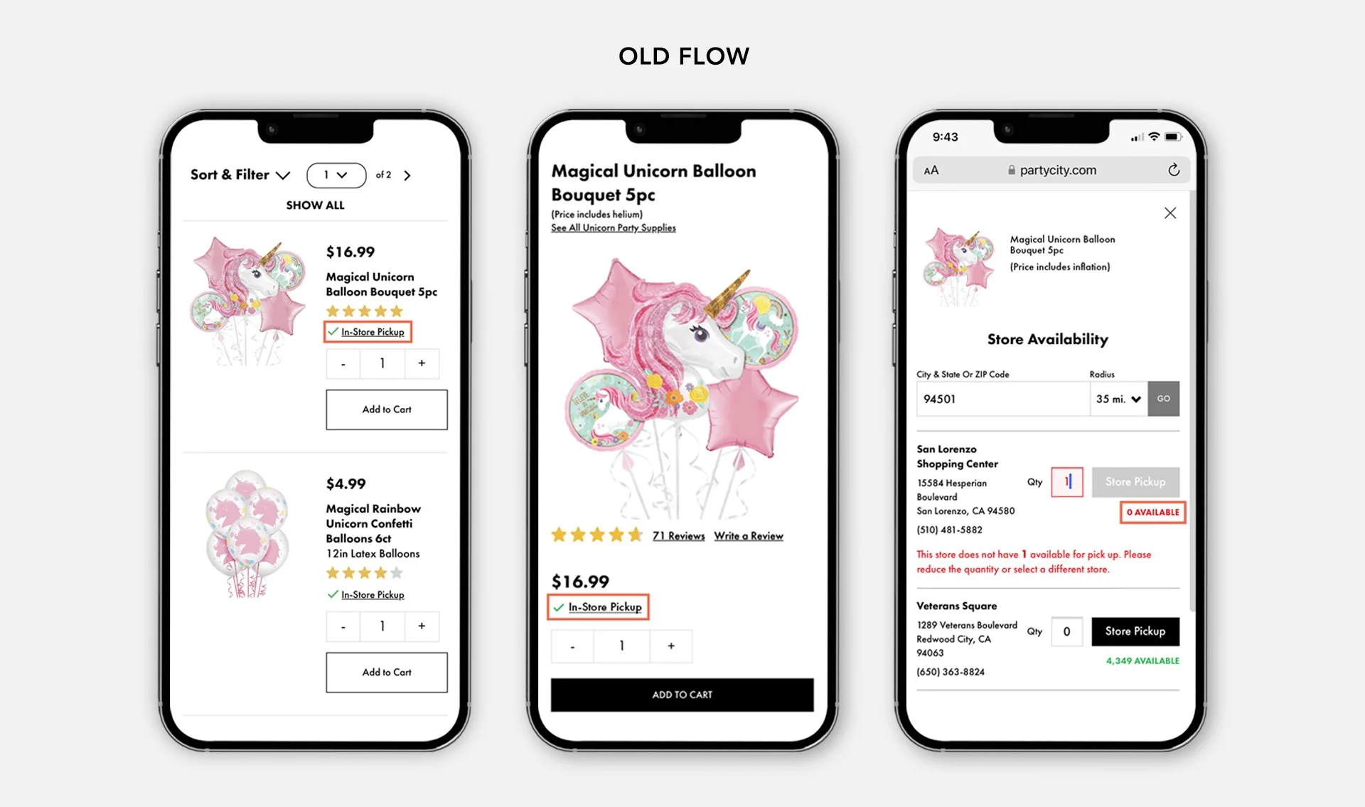
Old In-Store Pickup Experience (Highlights Added)
THE PROCESS - STEP 2
The Solution
Goal: display inventory positions clearly and offer workarounds for inventory shortages.
We wanted to create visual cues that would:
Make users aware of their nearest store and surface live inventory.
Allow users to filter out products that are unavailable.
Help users shop faster by improving scannability.
Provide clear alternatives when a desired item was out of stock at a user’s selected store.
Global store banner minimized inventory confusion by automatically setting a user's default store based on geolocation.
We started by creating a banner that automatically set a user’s nearest pickup store using geolocation data from their IP address. From then on, all inventory data would be dynamically pulled from that specific store, so users were clear on which items were in stock or sold out. If a user’s desired items were sold out at their nearest store, we allowed them to switch to another store or change their shopping preference to standard shipping (which displayed inventory data from our main warehouse).

Global Store Banner
Redesigning the PLP with a 2-column grid, inventory status labels, and an in-stock checkbox allowed users to shop faster.
For the product listing page, we wanted users to be able to browse more quickly and focus only on the items in their store. To improve scannability, we redesigned the product listing page to be a 2-column grid, added colored inventory status labels, and included a “show in-stock items only” checkbox that allowed users to filter out the clutter of the items they couldn’t get.

Old Product Listing Page

New Product Listing Page
Adding shopping preference swatches and stock quantity on the product detail page eliminated confusion
We also redesigned each item’s product detail page with the same shopping preference swatches featured in the universal store banner. This enabled users to view inventory positions directly on the page, removing the confusion caused by a hidden modal.

Old Product Detail Page

New Product Detail Page
Featuring granular inventory statuses in Cart removed another barrier to checkout
During testing, we noticed that users often added items to their cart with a combination of pickup, delivery, or shipping preferences. After reaching their cart, they would try to choose one preference that had all their desired items in stock, often navigating back and forth to the product pages to check inventory.
To help users circumvent this tedious process, we decided to display all inventory statuses granularly in the cart. This allowed users to see—at-a-glance—which items were in-stock or out-of-stock, removing another blocker from checkout.

Old Cart

New Cart
Final Thoughts & Next Steps
After launch, analytics showed that cart abandonment had decreased by 6%. Conversion had also increased by 1% during a 90-day monitoring period (and 32% after our busy season). Reports from our feedback tool also indicated that customer satisfaction had increased by 10%. For future iterations, we hoped to include the inventory positions of swatches (numbers, letters, and sizes) onto the product listing and product detail pages.