Party City
Simplifying the Balloon Experience

Summary
Mission
Party City is the largest retailer of party goods in the U.S. The highest performing product category is balloons, with 80% of users including at least one balloon in their order. Their goal was to improve balloon product ratings by streamlining the purchasing process and pickup experience.
My Contributions
As the principal UX Designer, I was responsible for researching user pain points and redesigning the balloon experience across the entire site. The redesign (1) decreased total shopping time by automatically setting helium inflation as the default option and selecting the nearest pickup store using geo-location, (2) added balloon education to prevent user errors, and (3) eliminated redundancy by moving balloon scheduling options to the end of the flow.
Impact
After the redesign, we saw a 78% click reduction to purchase a balloon and an improved star rating score for latex balloons by 20%.
Client
Party City | Pleasanton, CA
Services
User Interface Design
User Experience Design
Webflow Development
User Experience Strategy
User Research
Wireframing
THE PROCESS - STEP 1
Discovery
Platform & Users
Mobile and desktop site (75% of our users browse our site on a mobile device, and 70% convert on desktop). Our primary balloon target audience consisted of millenials (aged 17-23) and young mothers (aged 24-38).
The Problem
Although balloons were the top-selling product at Party City, we consistently received negative reviews across our site, social media channels, and customer service teams.
After thorough investigation, we discovered that the balloon purchasing process was lengthy and convoluted, involving high click-effort and repetitive steps to add helium inflation for each balloon in the cart. Additionally, customers didn’t know how many balloons could fit in a vehicle, how long they could float, or how to keep them from popping. This resulted in long shopping sessions, frustration at point-of-pickup, and customer complaints in our product reviews and across social media.
Problem #1: Our purchasing process was long and repetitive, asking users to select helium inflation and pickup date/time for each balloon added to cart.
“Your site is so slow and you make me do the same steps over and over.”
“The page froze, and when I refreshed, everything in my cart disappeared. I had to re-add everything, which took another hour!!
The sentiment echoed by our users above was that the balloon shopping process took much longer than expected. The user flow below illustrates the steps required to add a single balloon to the cart.
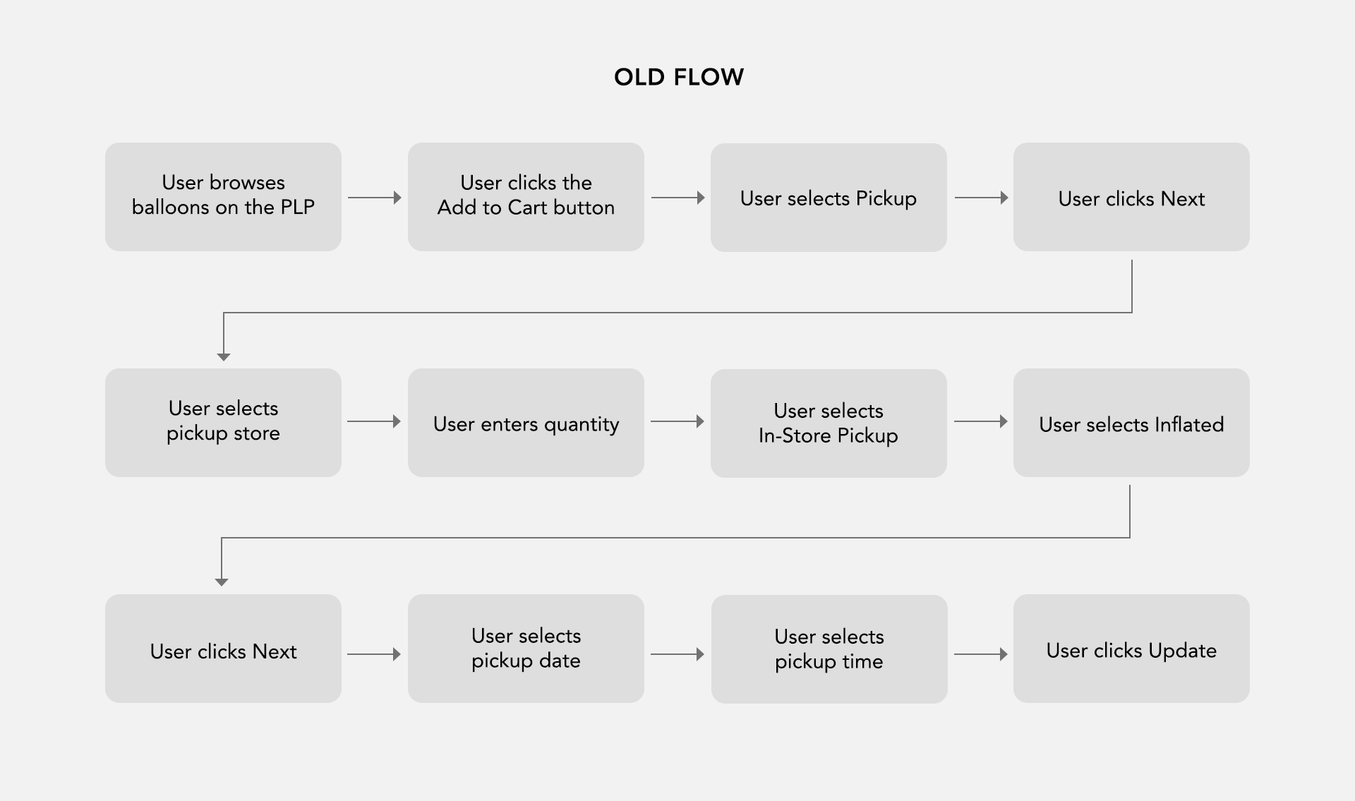
Old Balloon Purchasing Flow
Problem #2: Our site lacked information regarding float time, balloon transportation, and general balloon care.
Users would order latex balloons a day or more before the party, not realizing that they only had a 24-hour float time.
Users assumed they could pick up all of their balloons in one trip, but the average sedan could only fit 24 latex balloons (with no passengers).
Balloons would frequently pop or shrivel due to improper storage. Since helium expands and contracts, extremely hot temperatures would cause balloons to burst and extremely cold temperatures would cause balloons to shrivel.


Problem #3: Our customers didn’t realize that helium inflation was only offered for pickup and delivery orders.
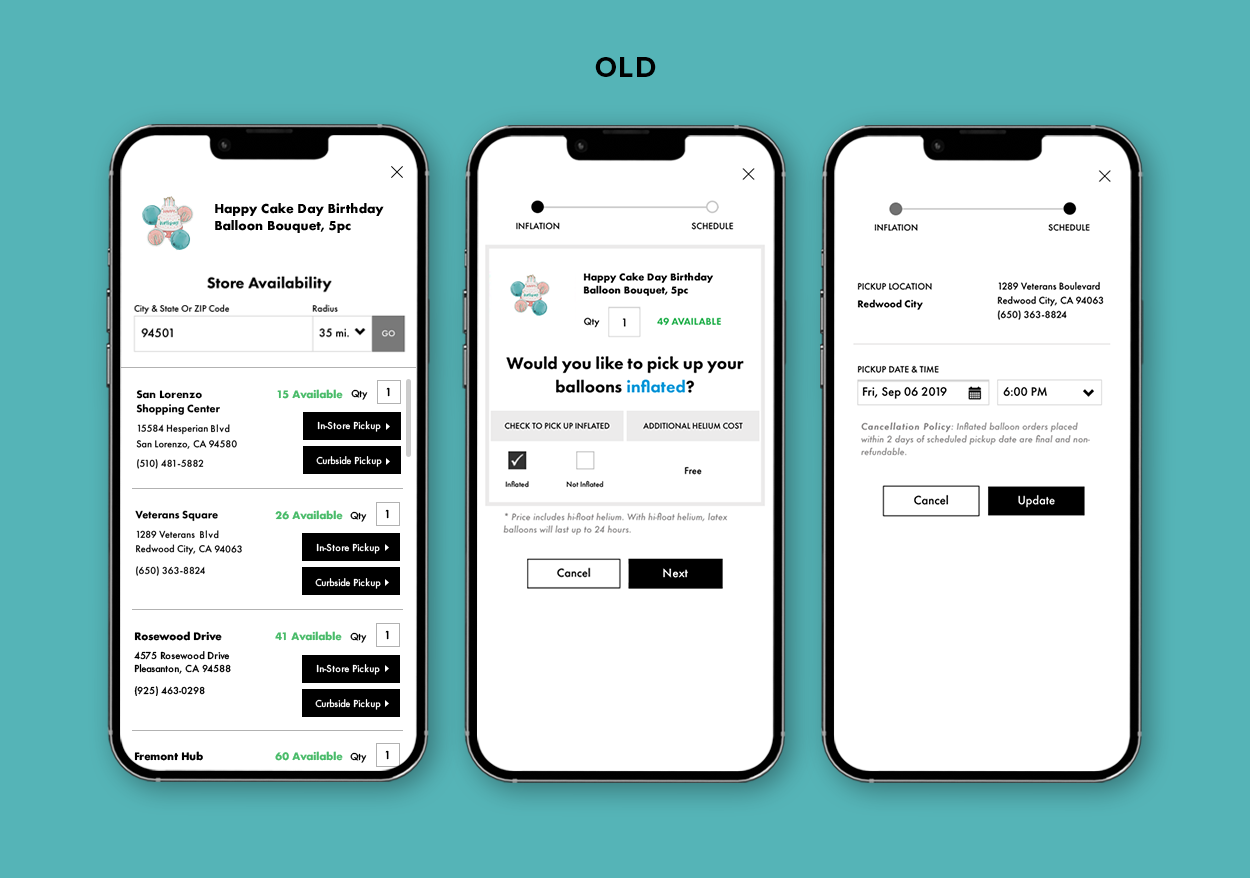
The old add-to-cart modal (see image) didn’t clearly state the difference between pickup, delivery, and standard shipping orders. This caused confusion when users expected shipped balloons to come inflated, but instead received flat balloons in a box.


THE PROCESS - STEP 2
The Solution
Goal: shorten the balloon flow and educate users at key touchpoints to give them the optimal experience
We wanted to create designs that would:
Reduce the number of steps required to add a balloon to cart
Help users choose the correct day to pick up balloons
Explain how to transport and care for balloons
Reduce balloon-related errors when switching shopping methods
The redesigned flow featured only 2 clicks to add to cart, as opposed to the old flow, which required 9.
To reduce the click effort to add a balloon to cart, we first condensed all the actions a user had to take from 5 to 2 screens, reducing the number of clicks by 78%.

Old Add-to-Cart Flow

New Add-to-Cart Flow
Automation for store and inflation selection reduced repetitive steps.
We redesigned key features on both the add-to-cart-modal and the product detail page to automate as much of the balloon shopping process as possible. First, we automatically set our users’ pickup store using geolocation data from their IP address. Secondly, we created inflation swatches so that users could easily toggle between helium-inflated versus non-inflated balloons. If a customer opted for helium inflation, we prevented them from making a user error by deactivating standard shipping (since they could not receive inflated balloons in a shipping parcel). And lastly, to reduce repetitive steps, we appended a cookie to their shopping session that would apply their pickup store and inflation selection to all future balloons.

Old Product Detail Page

New Product Detail Page
Moving pickup scheduling to checkout enabled users to perform the task only once for all the balloons in their order.
In the old flow, users had to interact with 3 screens to schedule a balloon pickup. To streamline the process, we condensed all the actions onto one screen and then moved this screen to Checkout so that pickup scheduling would only have to be done once for all the balloons in cart.
Old Pickup Scheduling Flow

New Pickup Scheduling Flow
Balloon education, instructions, and pickup calendar helped to manage user expectations.
To minimize errors and ensure that balloons came as expected, we inserted educational content where users scheduled balloon pickup.
Balloon scheduling instructions - to inform users to schedule balloon pickup on the same day as their celebration
Vehicle capacity message - to prime users to pick up their balloons with an appropriately-sized vehicle (or plan for multiple trips)
Assembly instructions - to make sure balloons were arranged as users envisioned
Balloon pickup calendar and time slots - to prevent mistakes during scheduling (i.e. during store closures) and help store associates with order priority

Balloon Pickup & Assembly Instructions

Pickup Calendar & Time Slots
Adding balloon care tips reminded customers about proper balloon pickup and storage.
We decided to add balloon care tips to the order confirmation and pickup notification email to remind users to protect their balloons during transit and at their party. We also included troubleshooting and safety information to help users if they experienced problems.
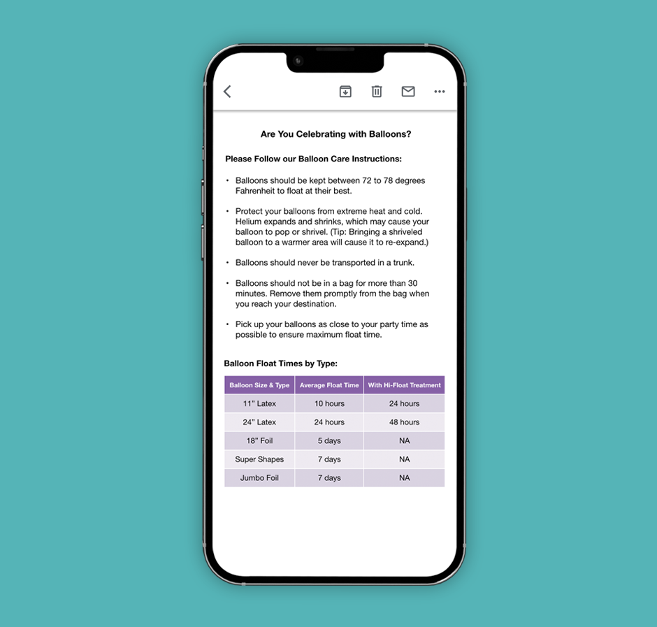
Balloon Care & Float Times

Balloon Safety
Final Thoughts & Next Steps
After launch, we noticed a decrease in negative reviews related to balloon deflation under 24-hours, with latex balloons also receiving a 20% increase in star ratings. Balloon conversion also improved by 1% over a 1-month observation period. After testing Assembly Instructions, we noticed that users frequently asked for customizations that couldn’t be executed by store associates. Future iterations would feature more guidance from a dropdown menu with clear options.