Pandia Health
Building Trust While Requesting Sensitive Data

Summary
Mission
Pandia Health is a birth control delivery company that offers an online prescription-writing service as opposed to the traditional method of obtaining a prescription through a doctor's appointment. Their goal was to increase sign-up conversion and reduce sign-up abandonment.
My Contributions
With a team of two other UX Designers, I redesigned the flow with information icons to provide clear explanations regarding how patient information would be used, overview screens priming users to have specific documents on-hand, and "save and skip" features that enabled users to take control of their experience.
Impact
After the redesign, polling showed that confusion regarding the sign-up flow was eliminated and there was a 30% growth in conversion.
Client
Pandia Health | San Francisco, CA
Services
User Interface Design
User Experience Design
User Research
Persona Creation
Journey Mapping
Wireframing
Brand Design
Webflow Development
THE PROCESS - STEP 1
Discovery
Identifying our target audience resulted in two personas
Before we could address the issues with conversion, our first task was to identify our target demographic. Based on analytics, our target audience consisted of women between the ages of 25-34 who were avid mobile device users.
From there, we further segmented our users into two personas—those who were newer to birth control and those who already had a strong preference.

User Persona 1

User Persona 2
In-depth interviews revealed user anxieties regarding their medical and identity information
We decided that the best way to understand why and where our target users were exiting the flow was to gather qualitative data through facilitated usability tests. We found 8 users in our target age demographic who were currently using birth control and asked them to go through the sign-up process, commenting on each screen of the flow as they went.
Our results showed that the main reason users didn't complete the sign-up flow was simply because they didn't know what to expect, which in turn caused them to feel frustrated and suspicious about why they were being asked to give their personal information. The journey map below shows the screens where users felt they were thrown a “curveball” in terms of expectations.
Journey Map of User Emotions at Key Touchpoints
The Problem
There were multiple causes of sign-up abandonment:
Users didn't have the required documents ready to fill out an upcoming section.
Users didn't know why they needed to provide a certain piece of personal information (i.e. government-issued IDs or a photo of themselves).
Users would leave and realize they couldn't return to their previous position.
Users didn’t realize there was a fee for this service.
THE PROCESS - STEP 2
The Solution
Goal: provide users with information that helped them feel informed and in-control
We wanted to design specific visual cues that would:
Tell users what documents they would need to have on-hand before they begin
Answer common user questions
Help users anticipate the next step
Enable users to pause and come back when they're more prepared
Provide reassurance that users are completing sign-up correctly
Our style guide created a cohesive look while adhering to existing brand guidelines
Next, we created a style guide to unite all of our designs moving forward. While we were constrained by existing typography and brand colors, we also strove to create buttons and icons to match the aesthetic. Our overall goal was to minimize development time wherever possible and provide an organic transition for existing users.

Style Guide
Updated UI modernized the experience
Our new screens featured the existing brand colors with updated imagery, infographics, and form validation. We designed our brand voice to be friendly, knowledgeable, and professional, just like an in-person doctor’s visit.
Updated UI
Required documents and info icons managed user expectations
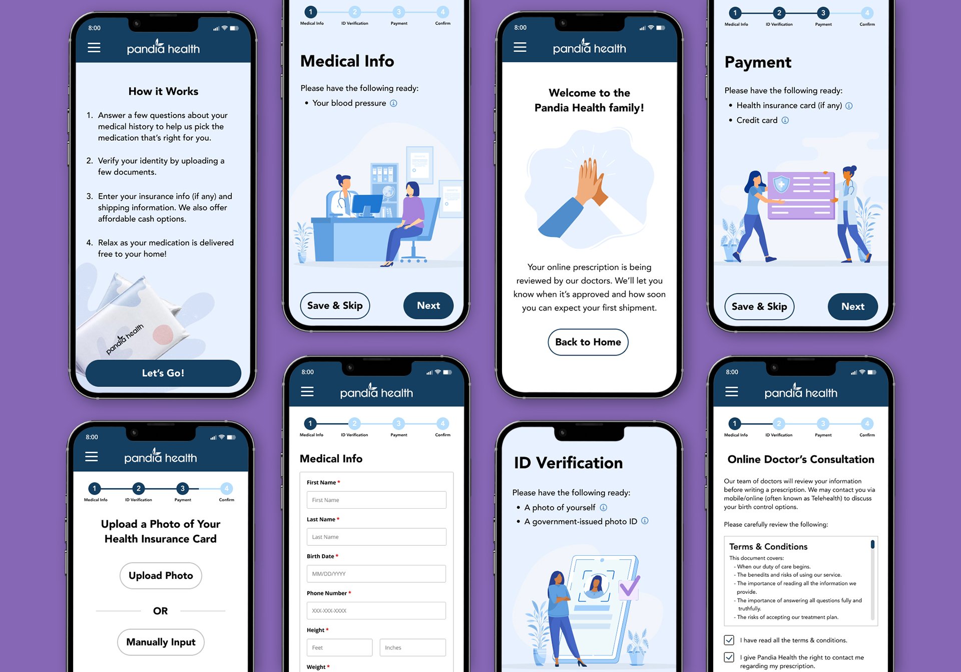
To prepare users to complete sign-up, we inserted a list of required documents at the beginning of the flow. We placed an information icon next to each required document to address potential questions or concerns. When clicked, these icons opened modals with in-depth explanations for users who matched our Careful Carol persona, while still remaining unobtrusive for users who didn’t need more information, such as those belonging to our Quick Katie persona.

Required Documents

More Information Modal
Overview pages reminded users which documents they needed if they were interrupted
We also created a series of overview pages at the beginning of each section because we noticed that users had a tendency to forget which documents they needed due to interruptions.

Overview Pages
Updated progress bar helped users gauge completion time
Based on our research, users were often trying to complete this sign-up process quickly on a mobile device. To ease frustration from the long sign-up process, we created a progress bar that allowed users to anticipate next steps and gauge completion time.

Old Progress Bar
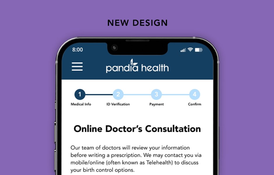
New Progress Bar
‘Save & skip’ button and the review screen gave users the flexibility to complete parts of the flow later
Many users will begin the sign-up process before having all the required documents on-hand. The save and skip button at the bottom of each overview page gave them the option to save and return when they felt more prepared. Or, if users had certain documents and not others, they could finish the sections that they were already prepared to complete.
The review screen further established trust by reminding users to go back to finish incomplete sections. This provided further reassurance to users that they completed sign-up correctly.

Save & Skip Instructions

Review Page
THE PROCESS - STEP 3
Validation
Testing yielded positive feedback
Usability tests showed a significantly more positive response to the problem screens. Users felt reassured by the clarification questions at the beginning of each section, saying that they felt like their concerns were acknowledged and addressed.

Testing the Updated Flow
Final Thoughts & Next Steps
While the updates were recevied favorably by most of our testers, some also expressed confusion over the "save & skip button" changing into the "back button" and were still surprised by the $29 online consultation fee. Our future iterations would further differentiate the two buttons stylistically and feature the $29 online consultation fee in the “documents needed” page. We would also like to work on redesigning the "medical history" and "birth control preference" sections in the sign up process.